Plotting Results
Overview
pySPAC integrates with matplotlib for visualization. Use generateModel() to create smooth model curves for plotting.
Basic Phase Curve Plot
Simple Plot
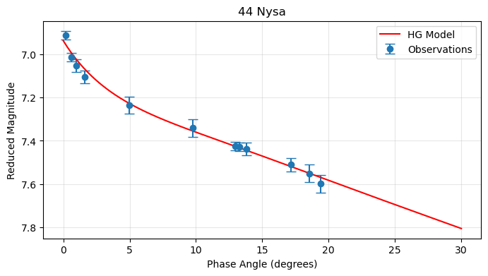
import numpy as np
import matplotlib.pyplot as plt

# After fitting a model
pc.fitModel(model="HG", method="trust-constr")

# Plot observational data
plt.errorbar(pc.angle, pc.magnitude, yerr=pc.magnitude_unc,
            fmt='o', capsize=5, label='Observations')

# Generate and plot model curve
model_angles = np.linspace(0, 30, 200)
model_mags = pc.generateModel(model="HG", degrees=model_angles)
plt.plot(model_angles, model_mags, 'r-', label='HG Model')

# Format plot
plt.gca().invert_yaxis()  # Astronomy convention: dimmer is up
plt.xlabel('Phase Angle (degrees)')
plt.ylabel('Reduced Magnitude')
plt.title('44 Nysa')
plt.legend()
plt.grid(True, alpha=0.3)
plt.show()
Enhanced Plot
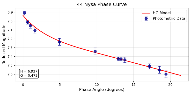
def plot_phase_curve(pc, model_name=None, title="Phase Curve"):
    """Create enhanced phase curve plot."""

    if model_name is None:
        model_name = pc.fitting_model

    fig, ax = plt.subplots(figsize=(8, 4))

    # Plot data with error bars
    ax.errorbar(pc.angle, pc.magnitude, yerr=pc.magnitude_unc,
               fmt='o', capsize=4, markersize=8, color='darkblue',
               label='Photometric Data', alpha=0.8)

    # Generate smooth model curve
    angle_range = np.linspace(max(0, np.min(pc.angle)-2),
                             np.max(pc.angle)+2, 300)
    model_curve = pc.generateModel(model=model_name, degrees=angle_range)

    ax.plot(angle_range, model_curve, 'r-', linewidth=2,
           label=f'{model_name} Model')

    # Add parameter text
    if pc.params:
        param_text = []
        for param, value in pc.params.items():
            if not param.lower().startswith('constraint'):
                param_text.append(f'{param} = {value:.3f}')

        textstr = '\n'.join(param_text)
        props = dict(boxstyle='round', facecolor='white', alpha=1)
        ax.text(0.03, 0.15, textstr, transform=ax.transAxes,
               verticalalignment='top', bbox=props)

    # Formatting
    ax.invert_yaxis()
    ax.set_xlabel('Phase Angle (degrees)', fontsize=12)
    ax.set_ylabel('Reduced Magnitude', fontsize=12)
    ax.set_title(title, fontsize=14)
    ax.legend(fontsize=11)
    ax.grid(True, alpha=0.3)

    plt.tight_layout()
    plt.show()

# Usage
plot_phase_curve(pc, title="44 Nysa Phase Curve")
Residual Plots
Basic Residuals
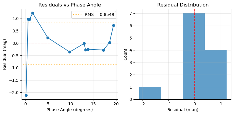
def plot_residuals(pc):
    """Plot fit residuals."""

    if pc.fit_residual is None:
        print("No residuals available - fit a model first")
        return

    residuals = np.array(pc.fit_residual)

    fig, (ax1, ax2) = plt.subplots(1, 2, figsize=(8, 4))

    # Residuals vs phase angle
    ax1.plot(pc.angle, residuals, 'o-', markersize=6)
    ax1.axhline(y=0, color='red', linestyle='--', alpha=0.7)

    # Add RMS line
    rms = np.sqrt(np.mean(residuals**2))
    ax1.axhline(y=rms, color='orange', linestyle=':', alpha=0.7, label=f'RMS = {rms:.4f}')
    ax1.axhline(y=-rms, color='orange', linestyle=':', alpha=0.7)

    ax1.set_xlabel('Phase Angle (degrees)')
    ax1.set_ylabel('Residual (mag)')
    ax1.set_title('Residuals vs Phase Angle')
    ax1.legend()
    ax1.grid(True, alpha=0.3)

    # Residual histogram
    ax2.hist(residuals, bins=max(3, len(residuals)//3), alpha=0.7)
    ax2.axvline(x=0, color='red', linestyle='--', alpha=0.7)
    ax2.set_xlabel('Residual (mag)')
    ax2.set_ylabel('Count')
    ax2.set_title('Residual Distribution')
    ax2.grid(True, alpha=0.3)

    plt.tight_layout()
    plt.show()

# Usage
plot_residuals(pc)
Model Comparisons
Multiple Models
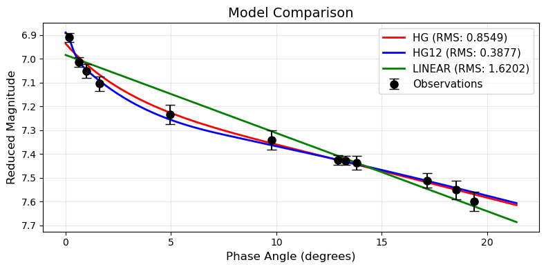
def plot_model_comparison(pc, models=["HG", "HG12", "LINEAR"]):
    """Compare multiple models on same data."""

    fig, ax = plt.subplots(figsize=(8, 4))

    # Plot data
    ax.errorbar(pc.angle, pc.magnitude, yerr=pc.magnitude_unc,
               fmt='o', capsize=5, markersize=8, color='black',
               label='Observations', zorder=10)

    # Generate angle range for smooth curves
    angle_range = np.linspace(max(0, np.min(pc.angle)-2),
                             np.max(pc.angle)+2, 200)

    colors = ['red', 'blue', 'green', 'orange', 'purple']

    # Fit and plot each model
    for i, model in enumerate(models):
        try:
            # Fit model
            method = "trust-constr" if model != "LINEAR" else "leastsq"
            pc.fitModel(model=model, method=method)

            # Generate curve
            model_curve = pc.generateModel(model=model, degrees=angle_range)

            # Calculate RMS for legend
            rms = np.sqrt(np.mean(np.array(pc.fit_residual)**2))

            # Plot
            color = colors[i % len(colors)]
            ax.plot(angle_range, model_curve, '-', linewidth=2, color=color,
                   label=f'{model} (RMS: {rms:.4f})')

        except Exception as e:
            print(f"Failed to fit {model}: {e}")

    ax.invert_yaxis()
    ax.set_xlabel('Phase Angle (degrees)', fontsize=12)
    ax.set_ylabel('Reduced Magnitude', fontsize=12)
    ax.set_title('Model Comparison', fontsize=14)
    ax.legend(fontsize=11)
    ax.grid(True, alpha=0.3)

    plt.tight_layout()
    plt.show()

# Usage
plot_model_comparison(pc, models=["HG", "HG12", "LINEAR"])
Uncertainty Visualization
Parameter Distributions
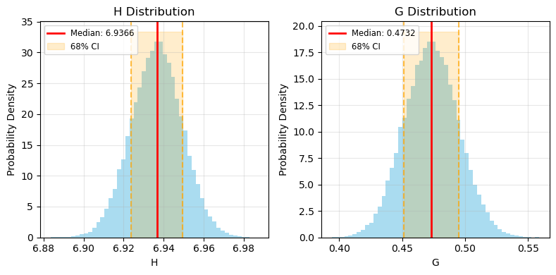
def plot_parameter_distributions(pc):
    """Plot Monte Carlo parameter distributions."""

    if pc.montecarlo_uncertainty is None:
        print("Run Monte Carlo analysis first")
        return

    mc_data = pc.montecarlo_uncertainty
    n_params = len(mc_data)

    fig, axes = plt.subplots(1, n_params, figsize=(8,4))
    if n_params == 1:
        axes = [axes]

    for i, (param, samples) in enumerate(mc_data.items()):
        ax = axes[i]

        # Histogram
        ax.hist(samples, bins=50, alpha=0.7, density=True, color='skyblue')

        # Add percentile lines
        median = np.percentile(samples, 50)
        lower = np.percentile(samples, 15.87)
        upper = np.percentile(samples, 84.13)

        ax.axvline(median, color='red', linewidth=2, label=f'Median: {median:.4f}')
        ax.axvline(lower, color='orange', linestyle='--', alpha=0.7)
        ax.axvline(upper, color='orange', linestyle='--', alpha=0.7)

        # Shaded region
        ax.fill_betweenx([0, ax.get_ylim()[1]], lower, upper,
                        alpha=0.2, color='orange', label='68% CI')

        ax.set_xlabel(param)
        ax.set_ylabel('Probability Density')
        ax.set_title(f'{param} Distribution')
        ax.legend(fontsize="small")
        ax.grid(True, alpha=0.3)

    plt.tight_layout()
    plt.show()

# Usage after Monte Carlo
pc.monteCarloUncertainty(n_simulations=50000, model="HG", method="trust-constr")
plot_parameter_distributions(pc)
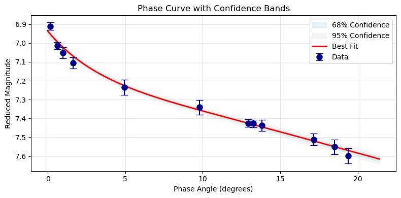
Confidence Bands
def plot_confidence_bands(pc, model_name=None, n_curves=500):
    """Plot phase curve with confidence bands."""

    if pc.montecarlo_uncertainty is None:
        print("Run Monte Carlo analysis first")
        return

    if model_name is None:
        model_name = pc.fitting_model

    # Generate angle range
    angle_range = np.linspace(max(0, np.min(pc.angle)-2),
                             np.max(pc.angle)+2, 200)

    # Generate curves from Monte Carlo samples
    mc_samples = pc.montecarlo_uncertainty
    param_names = list(mc_samples.keys())
    n_samples = len(mc_samples[param_names[0]])

    curves = []
    for i in range(min(n_curves, n_samples)):
        # Create parameter set for this sample
        temp_params = {param: samples[i] for param, samples in mc_samples.items()}

        # Generate curve
        try:
            temp_pc = PhaseCurve(angle=angle_range, params=temp_params)
            curve = temp_pc.generateModel(model=model_name, degrees=angle_range)
            curves.append(curve)
        except:
            continue

    if not curves:
        print("Could not generate confidence bands")
        return

    curves = np.array(curves)

    # Calculate percentiles
    fig, ax = plt.subplots(figsize=(10, 6))

    # 68% confidence band
    lower_68 = np.percentile(curves, 15.87, axis=0)
    upper_68 = np.percentile(curves, 84.13, axis=0)
    ax.fill_between(angle_range, lower_68, upper_68,
                   alpha=0.3, color='lightblue', label='68% Confidence')

    # 95% confidence band
    lower_95 = np.percentile(curves, 2.5, axis=0)
    upper_95 = np.percentile(curves, 97.5, axis=0)
    ax.fill_between(angle_range, lower_95, upper_95,
                   alpha=0.2, color='lightgray', label='95% Confidence')

    # Best fit curve
    best_fit = pc.generateModel(model=model_name, degrees=angle_range)
    ax.plot(angle_range, best_fit, 'r-', linewidth=2, label='Best Fit')

    # Data points
    ax.errorbar(pc.angle, pc.magnitude, yerr=pc.magnitude_unc,
               fmt='o', capsize=5, markersize=8, color='darkblue',
               label='Data', zorder=10)

    ax.invert_yaxis()
    ax.set_xlabel('Phase Angle (degrees)')
    ax.set_ylabel('Reduced Magnitude')
    ax.set_title('Phase Curve with Confidence Bands')
    ax.legend()
    ax.grid(True, alpha=0.3)

    plt.tight_layout()
    plt.show()

# Usage
plot_confidence_bands(pc)
Next Steps
- Generate Models - Model generation from known parameters